“Dear Elena, in your logo: What do I see behind the words?” – “I am not too sure what is said behind the words, CreativElena. Is it a mermaid? I’m sorry if it’s not …” 😀
To be clear: My logo does not show a mermaid! But maybe it’s time I explain it a little more, thus time for a little story. Why? Well, right after the relaunch of my travel blog www.creativelena.com, I received many curious questions about my logo. So what is with the picture behind the lettering of CreativElena?
The answer to that question takes us right around the world.
To New Zealand, actually. As some of you might know, I have lived there for well over a year. Thanks to altogether three round-the-world trips to the “Land of the Long White Cloud” (Aotearoa, as the New Zealand Maori people call their homeland), I have already been able to share a lot of travel tips and (creative) travel stories about New Zealand for you. So what does this have to do with my logo?

The idea to my logo came right here, at New Zealand’s mind-bogglingly beautiful South Island West Coast. The logo itself is connected to the sea, but not in the form of a mermaid …
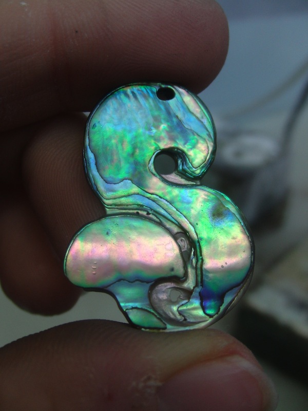
… but rather in the form of the indigenous mother-of-pearl Paua shell that can be found in New Zealand. I have chosen this shell to work it as a pendant as part of my first New Zealand trip, loving it so much I decided to use it as the base for my business logo.
It wouldn’t be CreativElena, if the idea to my logo had not come to me on one of my creative journeys around the world ..!
In fact, the design of the artwork as well as the material of the original shell both have a very strong meaning for me. The S-shape, or the shape of an 8, stands for the eternal flow and energy of life, the upper part for a gentle bow in humility of what remains to be learned, the whale fin at the bottom for the drive and strength to set out upon one’s path and keep discovering life and all its miracles, again and again. Naturally, I do love the pretty colours of the paua shell itself – a wonderful play of patterns my graphic designer and I could perfectly use when abstracting the original material to form a logo.
The idea to the original shell carving came to me during a trip to Hokitika, on the West Coast of New Zealand’s South Island, where back in 2008 (well before I started my own business or travel blog) I came across Steve and his “Bonz N Stonz” Carving Studio as part of my creative travels through New Zealand. I can still remember when we found paua shells on the beach at Hokitika, selected them and prepared them to be carved into a very personal pendant. In 2011, during another trip to the “Land of the Long White Cloud”, I was able to polish and refine the same pendant again. What an enchanting memento of an extraordinary travel experience!
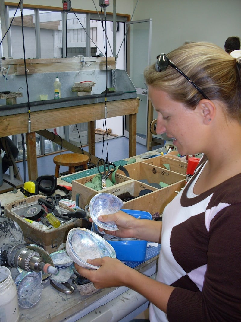
At the Carving Studio “Bonz N Stonz” in Hokitika, you can see me checking the still unpolished paua shells …
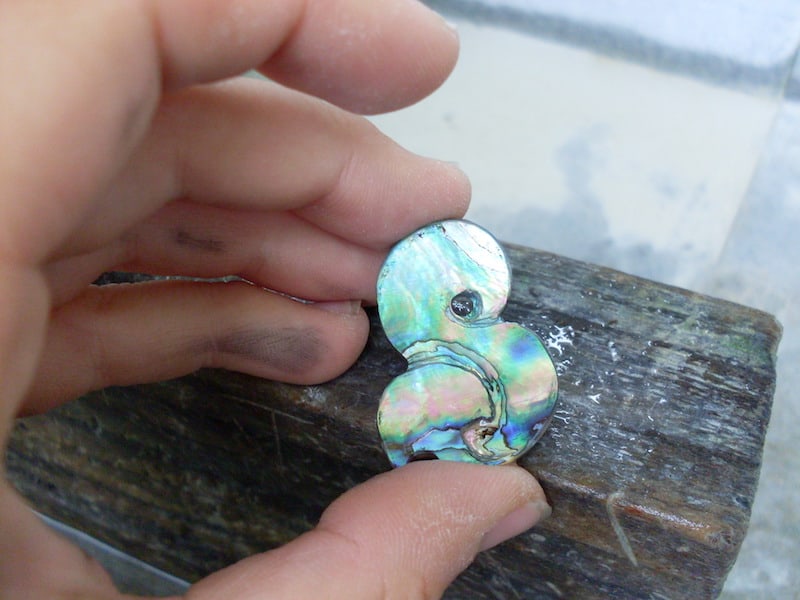
… before, after hours of work, I am able to hold my finished piece in my proud hands! How do you look at my logo now?
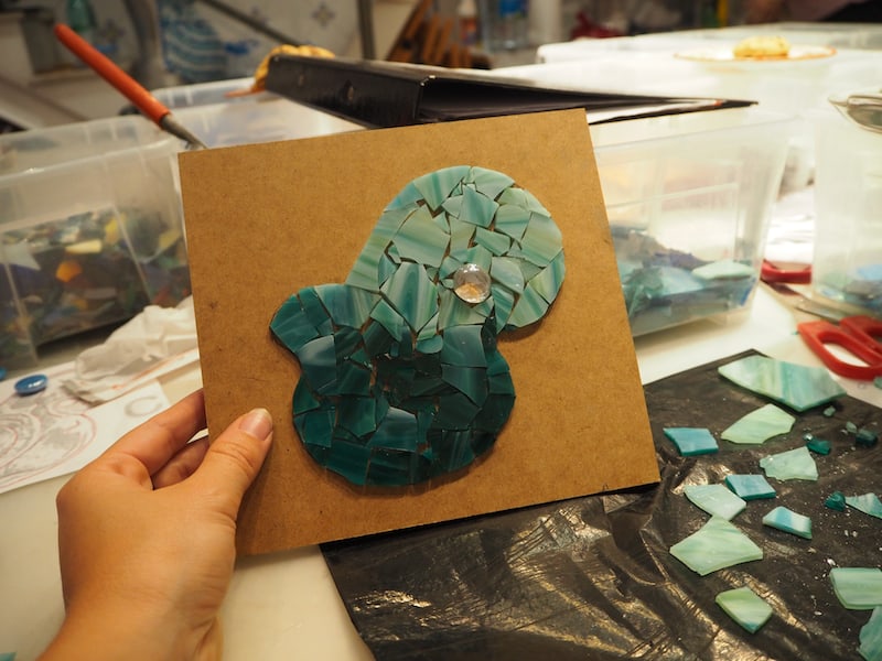
Years later, the New Zealand pendant comes up again as I use its shape and colours to form a creative mosaic in a Barcelona mosaic studio …
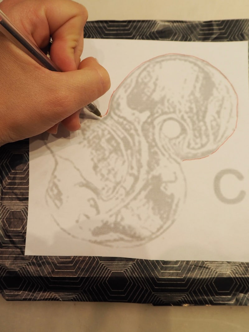
… and so the magic of New Zealand and all the inspiration I took from there ended up in shaping my business logo.
I do hope you liked my story and enjoy following me around the world to see where the inspiration, and meaning, for my CreativElena logo comes from! Here is a little further reading about creative travel and / or New Zealand:
- The Year Of My Life: Travelling Aotearoa New Zealand. Today: First Time Exploring Creative Travel
- The Year Of My Life: Travelling Aotearoa New Zealand. Today: Roadtrip from Kaikoura to Christchurch & Arthurs Pass
